Feed Image Editor offers a full suite of features to optimize product images for comparison engines. In today's article, we introduce three simple tips that will make your goods look more attractive.
Use a suitable color model
Color models describe colors based on the proportions of each component, which can be base colors or other parameters. The two most commonly used color models are RGB, which is suitable for screens, and CMYK, which is used for printing. If you edit images or create discount labels in graphic editors, be careful which graphics model you have preset in them.
If you export images with the CMYK color model, their colors may not appear accurately on comparison and advertising networks. It causes a problem when the image color does not match the actual color of the product. If you use the Feed Image Editor, you don't have to worry about that. The app works with the RGB model, and the color of your images will correspond to reality.
Highlight white products
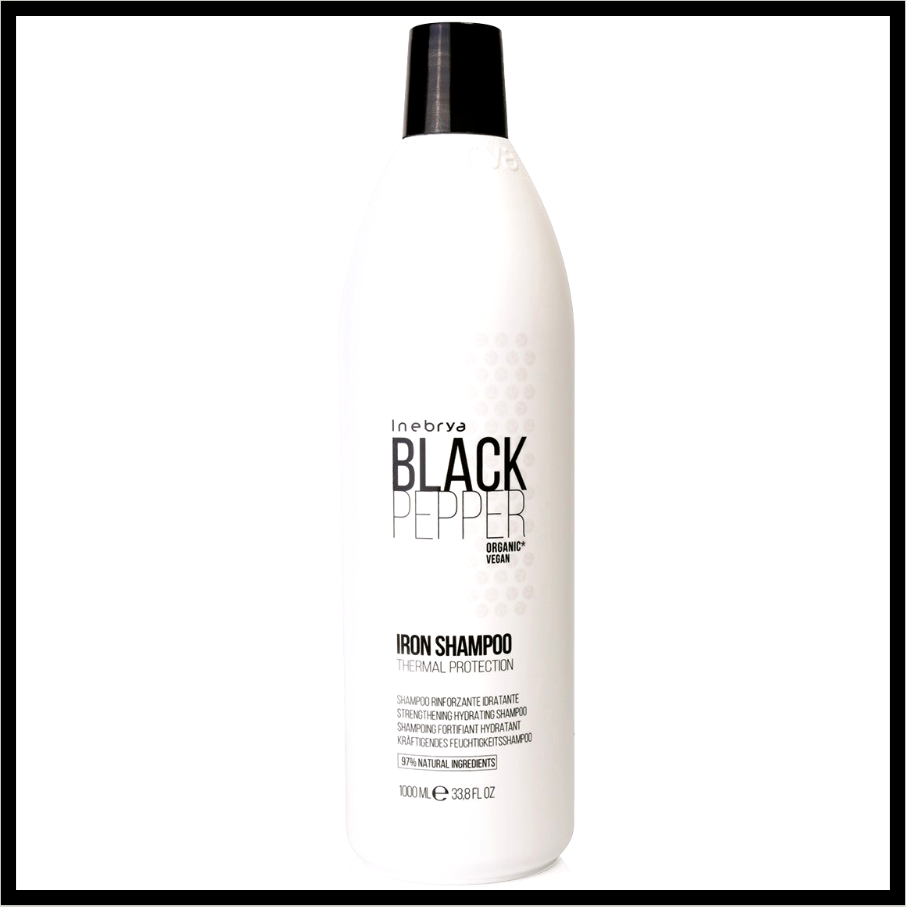
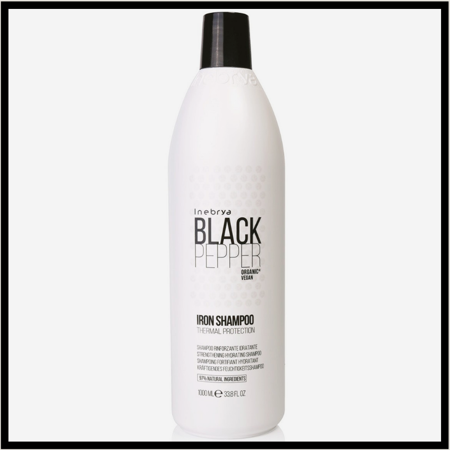
Porovnávače väčšinou požadujú biele pozadie. Pre tovar bielej farby to môže v niektorých prípadoch spôsobiť, že jeho kontúry budú nejasné a zníži sa jeho viditeľnosť. A to aj v prípadoch, že obrázok je kvalitný a vo veľkom rozlíšení. Riešením je upraviť u týchto obrázkov kontrast, čím zvýrazníte tovar a zachováte pritom biele pozadie. S Feed Image Editorom je postup jednoduchý:
Comparison engines usually require a white background. For white goods, this can, in some cases, make its contours unclear and reduce its visibility. Even if an image is of high quality and in high resolution. The solution is to adjust the contrast of these images to highlight the goods while maintaining a white background. With the Feed Image Editor, the process is simple:
- In the first step, make sure you have such images in the feed. Open Diagnostics and check the recommendations in the Low Quality Images box.
- After clicking it, you will get to the Products section, which contains a list of low-quality images.
- Select the ones that have white products on a white background and click Save As Query.
- For example, name the query „Low Contrast Images”.
- Create a new template and apply it to the query you made in the previous step.
- On the Format tab, adjust the contrast so it stands out more in the product images.
- Save the template. The changes will take effect after the application of the rules in Mergado.
Adjust the balanced font and background contrast
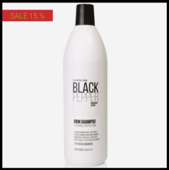
Balanced contrast is also major for the readability of the text on discount labels or banners. We recommend that you approach any combination of colors sensitively and consult with graphics. The online Contrast Checker can be a quick help. Just enter the hex codes of both colors. The app decides whether the colors fit together according to multiple criteria.

We believe these tips will help you improve your product images and increase your CTR. Go through the other instructions on our blog, which will make your work easier. If you do not know the settings, write us, or arrange a short online call, we will be happy to help you.



Add new comment